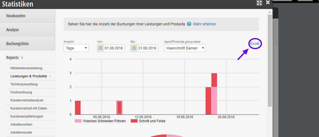
Using the Services and Products Report statistics, you can quickly find out which service or product is very popular with your customers and which service is less popular. Furthermore, you will know which services you should promote more with your customers.
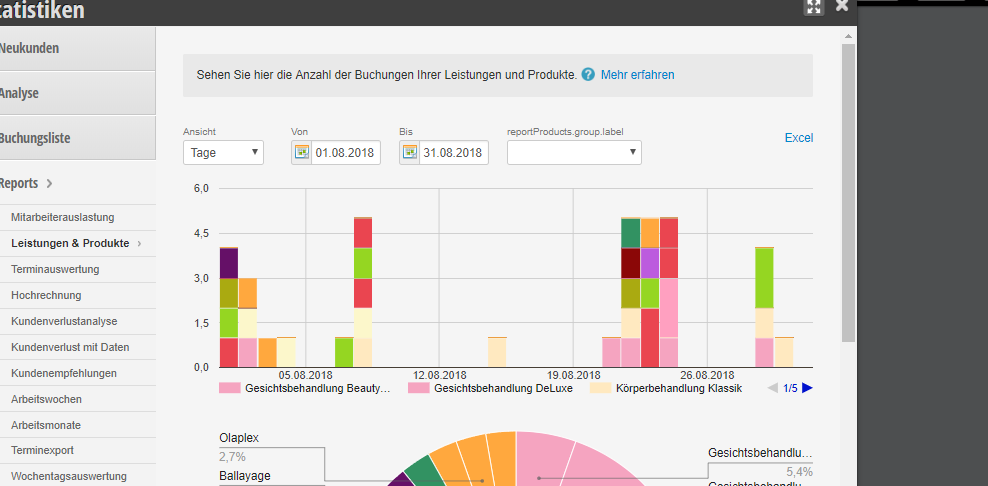
The services are color-coded. At first glance at the table, you can decide which of the services/products is the most popular. You can read the meaning of each color directly below the statistics.
The horizontal axis shows the individual days on which the services and products were sold. The vertical axis shows the number of services and products that were sold.
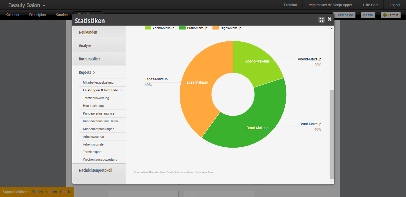
In our pie chart you can see the services even more clearly and with a percentage share. It is immediately apparent which of the services is the best-selling and most popular service.
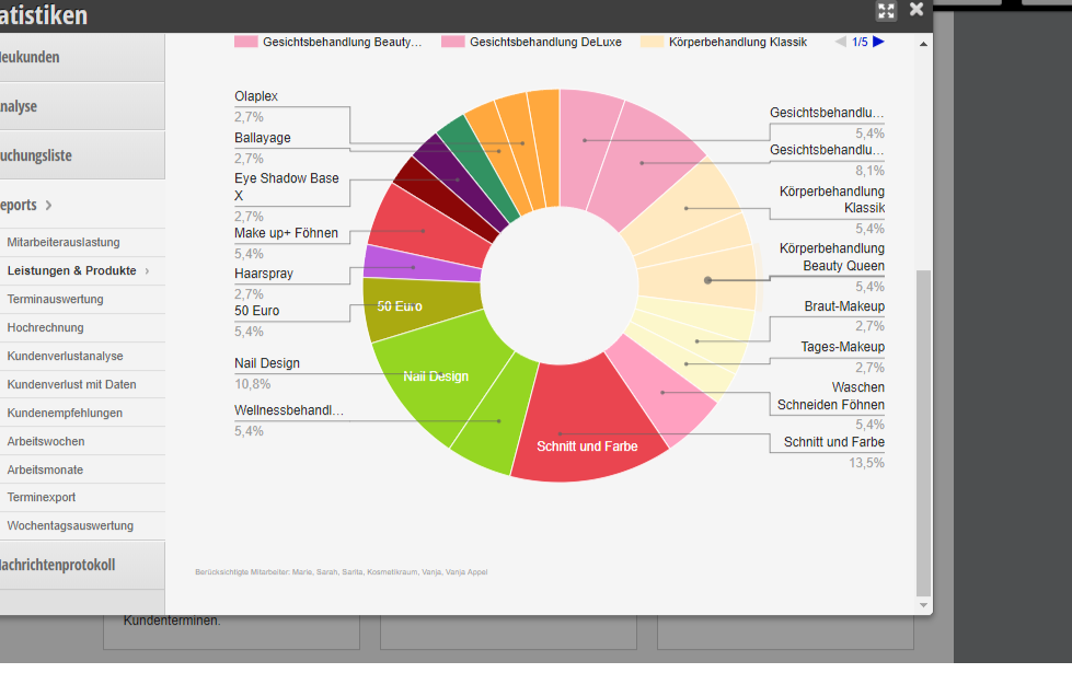
In this example, it is easy to see that the best-selling service is "Cut and Color".
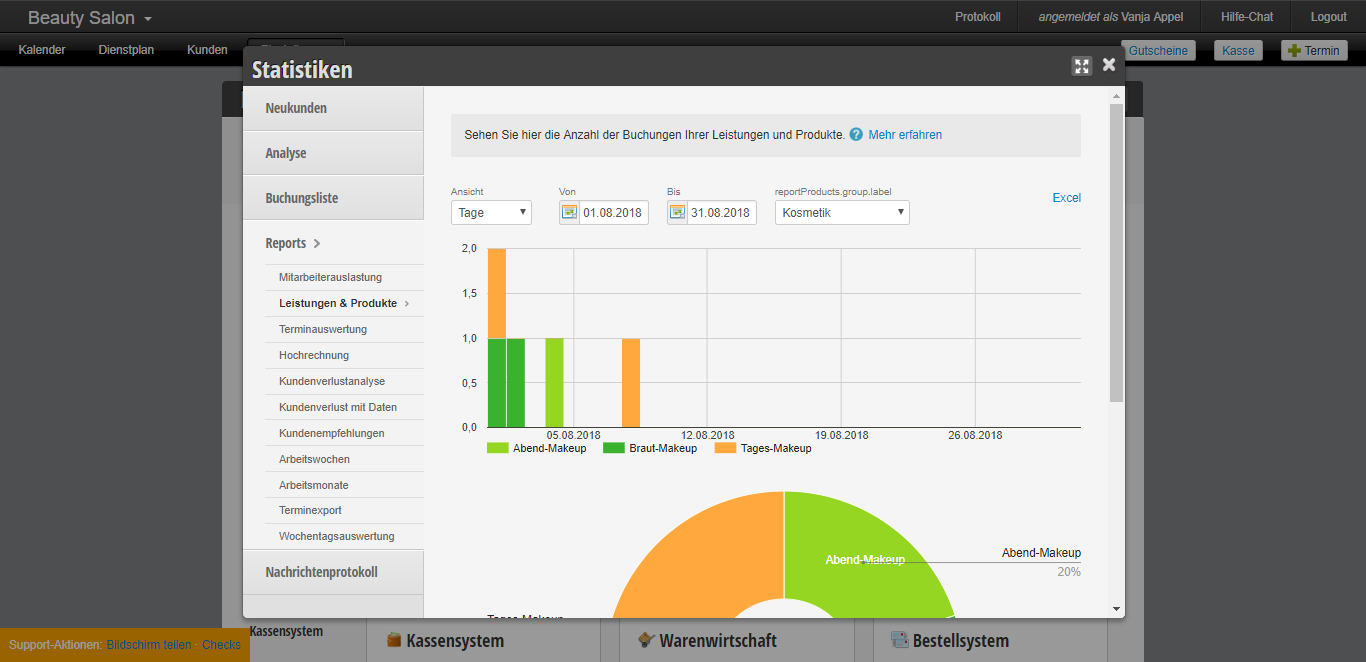
Next to the date there is a field with a selection of services. This way the statistics relate specifically to a service group, e.g. under the service group Cosmetics, you have the service Evening Make-Up but also Bridal Make-up and Day Make-up. This gives you a comparison only between these three services.
By clicking on the Excel button, you immediately get a detailed Excel file with all services and products that were sold in a specific period.